Update: I would say this method is still valid if you want to use single assets across all devices, but I am now using points and asset catalogs (even though it’s a lot of extra work).
I honestly thought I had it figured out.
I hadn’t.
I mean, I had. Except it’s always more complicated than that.
Let’s talk about scene sizes.
(Again.)
Using the Camera
To be fair to myself, there are certain genres of game that need to have fixed playable areas—my example game Swivel Turret is one of them. If it filled out the horizontal space on an iPad, that would mean bombs would be dropping over a wider targeting area than they would on an iPhone.

A fixed scene size that adds some black bars is a reasonable choice here.
Adventure games do not have to have fixed areas. There is no “unfair advantage” to be given to players using one device over players using another in a game that involves wandering around, picking up things, and talking to people.
I started playing around with the SKCameraNode and it’s great! It’s really easy to use, and it makes it very easy to decouple the size of the scene from what the player sees.
I don’t need to crop nearly as much out of scenes as I can use the camera as a window into the world. This window is sized based on the device and I can then move this window around the scene to reveal more of the scene as necessary.
Thinking in Pixels
As I mentioned in the previous post, I’m working in terms of pixels, not points.
To reiterate, this is because the 2x iPads use the same scale factor as the 2x iPhones.
If I wanted to use different sized assets for iPhones and iPads (which is very easy to do with asset catalogs), the fact that the same scale factor is used on both devices can cause issues with certain animation APIs (or any situation where you want to derive the size of a sprite from its asset, which is not unreasonable during development as the art styles change over time).
Using the same assets for all devices vastly simplifies game development. So much so that I think it’s worth using ugly, hacky workarounds to avoid needing to create assets that target different devices.
The Ugly, Hacky Workaround
I want all my assets to be at a 1x scale and therefore they should be created with the biggest device in mind (the iPad Pro 12.9″). All of my layouts will then be based on the pixel dimensions of a given scene.
I therefore need to use the pixel dimensions of the device in code.
However, most of the UIKit APIs assume you want to know the points value of the device. The CGRect values provided by the frame and bounds properties are all given in terms of points.
Thankfully there is one, UIScreen.main.nativeBounds, that gives the values of the pixel dimensions of the current device. There is a caveat that the values are always given in the portrait up orientation, whatever the actual orientation of the device.
I just need the size to set up a scene (not the origin) and so, for landscape games, I can just swap the width and height:
var size = CGSize(width: UIScreen.main.nativeBounds.size.height, height: UIScreen.main.nativeBounds.size.width)
let scene = Room(size: size, sceneName: "Start")
Add some camera code to have it follow the player as they move around and job’s done.
Except this is what each of the devices will actually “see” when the scene is rendered:
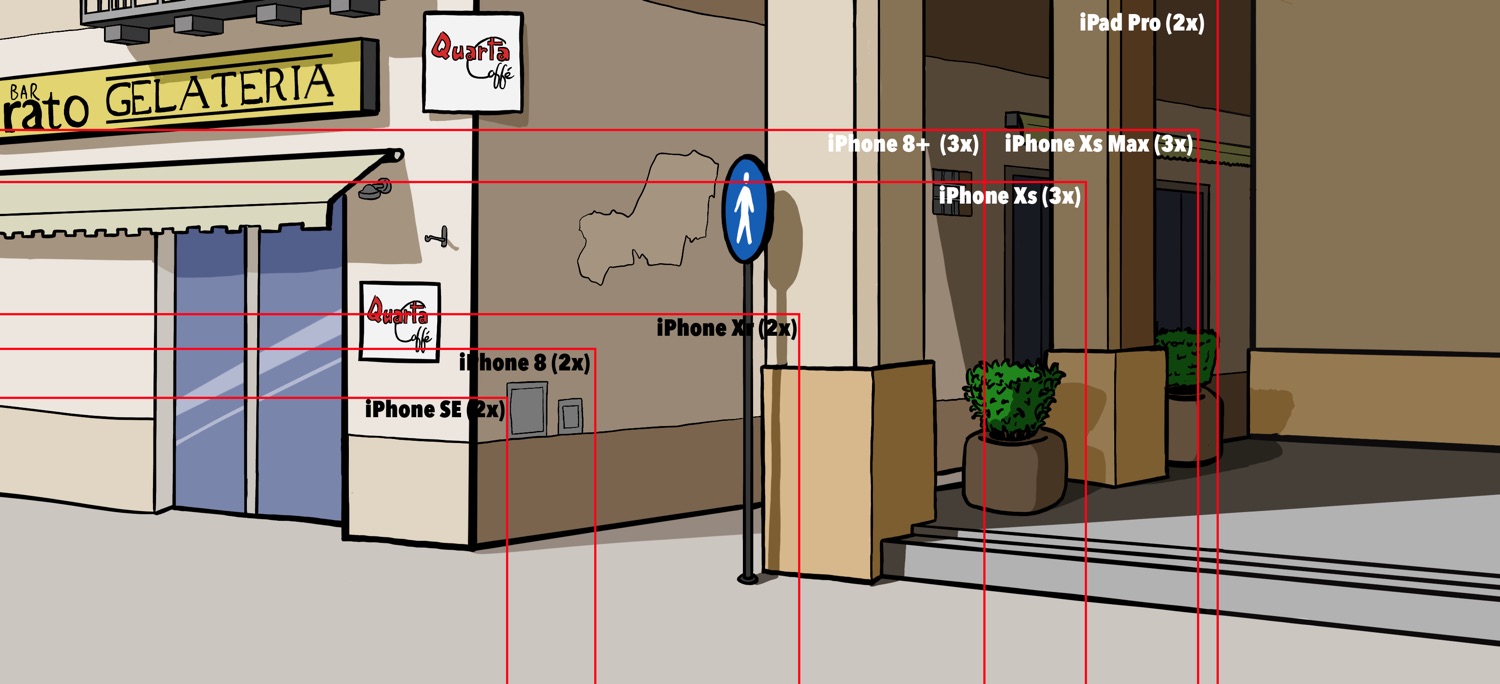
Clearly, there are some issues:
- The iPad Pro is too tall and would show a grey bar at the top
- The iPhone SE and iPhone 8 shows a tiny amount of the world
- The iPhone Xr shows a good amount of horizontal space but not nearly enough vertical space
This Is Why Apple Uses Points
The temptation here is to reach for the asset catalogs, create 2x and 3x versions of assets, use the iPhone and iPad buckets, and start using points to lay out everything.
And it’s a great temptation! It works really well in UIKit! Just look at this tight grouping of devices based on their point sizes:
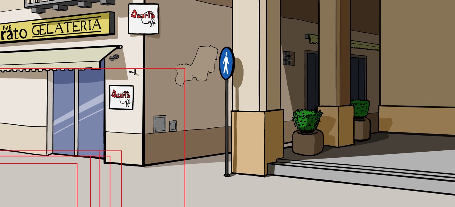
The problem is, once again, the goddamn iPads. If all of my game content is placed within that tight grouping, then iPad players will see so much wasted space.
And I can’t just double everything because…
If I plowed ahead and used different sized assets for iPads and iPhones then, even without this animation issue, I would need to double everything. Points, vectors, movement speeds, etc. The system would assume I’m using a 2x scale when I’m actually using a de-facto 4x scale.
Ugly Hack Improvements
What I need to do is to scale up the viewport on smaller devices and scale down the viewport on the larger iPads to create a reasonably sized window into the world:
// 1.
var size = CGSize(width: UIScreen.main.nativeBounds.size.height, height: UIScreen.main.nativeBounds.size.width)
// 2.
if size.height > 1536 {
	let ratio = UIScreen.main.nativeBounds.size.height / UIScreen.main.nativeBounds.size.width
	let newWidth = 1536 * ratio
	size = CGSize(width: floor(newWidth), height: 1536)
}
// 3.
if size.height < 1000 { // 4. if size.width > 1500 {
		size.width = floor(size.width * 1.5)
		size.height = floor(size.height * 1.5)
	} else {
		size.width = size.width * 2
		size.height = size.height * 2
	}
}
let scene = Room(size: size, sceneName: "Start")
- As the
nativeBoundsproperty is given as if the device was in portrait up orientation, and my adventure games only use landscape, I need to flip these values. - The maximum height of any given scene is 1536. Any device that has a height greater than this (the 12.9″ iPad Pro’s landscape height is 2048) needs to have the size of the viewport scaled down so that the image will fit. The scene will then be scaled up to fill the 2048 height of the screen, showing images at an effective 1.3x scale on 12.9″ iPad Pros.
- There also needs to be a minimum height check, as the 2x phones won’t show enough of the scene at their native resolutions. In this case, I just double the viewport size.
- However, if I double the Xr’s width (with its aspect ratio of 19.5:9), then it’s way too wide. So anything with a heigh less than 1,000 but a width greater than 1,000 should only be scaled up by 1.5x
Now here’s what the player sees when using different devices:
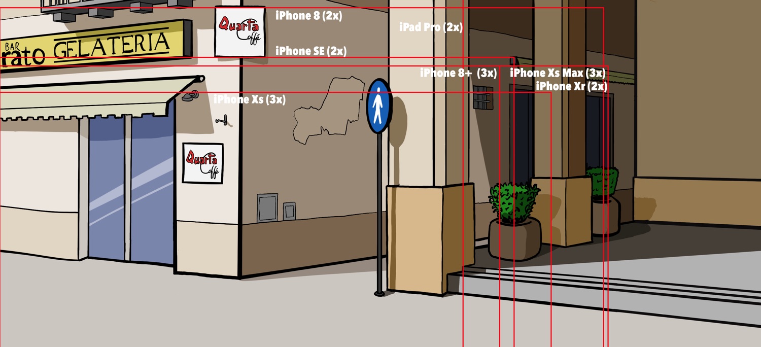
That’s better!
Every device is now using the same 1x asset while showing a good amount of the scene and everything still looks crisp (despite the image being scaled up slightly on an iPad Pro).
What About the Mac?
For the macOS version, I just hard-coded a 16:9 ratio with the 1536 maximum height and called it a day:
let root = Room(size: CGSize(width: 2720, height: 1536), sceneName: "Start")
There is the potential here for me to create a preferences dialog that allows players to choose different resolutions and ratios if testing proves that less beefy laptops can’t handle it.
Unified Asset Development
In terms asset creation, the scene sizes will need to be at least 2720 x 1536 pixels in size to ensure that they look crisp on an iPad Pro but still fill up the available width of the Mac version.
Capping the iPad Pro/Mac version at 1536 pixels high means that the width at a 16:9 ratio for the Mac version comes out at 2720 pixels (which, coincidentally, is close to the iPhone Xs Max width at 2688 pixels).
The 1536 height limit is a semi-arbitrary compromise to try not to overburden the smaller devices. It’s the height of the 9.7″ iPads in landscape, but even scaled up on the larger iPad Pros it still looks decent.
This is Not Ideal
Asking a 1136 x 640 pixel device to load a 2720 x 1536 pixel texture is, frankly, a bit rude.
Using 1x assets over all devices makes the memory footprint is a lot larger than it needs to be for everything that’s not an iPad Pro 12.9″.
There is probably a better way out there that does take advantage of asset catalogs without the issues caused by the vastly larger point dimensions of the 2x iPads over the 2x iPhones.
However, SpriteKit is well optimised and adventure games are not going to tax even older devices particularly hard and, as a solo developer, I need to take as many shortcuts as I can.
This is because creating 1x assets to be used across all devices simplifies more than just asset creation. There is one set of coordinates to rule them all, so positioning items and NPCs in the game data JSON files means that they are guaranteed to be in the same position on all devices.
So this is more than good enough for the moment.
I doubt this will be my last post about screen sizes, though…
(Update: It wasn’t.)