Time Remaining: 84 Hours
After playing around with Inverse Kinematics and struggling to get it to transfer the velocity of arm motion to the coin in a realistic way, I thought about how much time I wanted to spend getting this to work and came to the conclusion that I didn’t really like this idea enough. So I threw it out and started over, which is always a good idea when you have severe time limitations.
I considered the set of limited skills and experience I had with SpriteKit and figured out what I could do with them in a hundred hours and came up with:
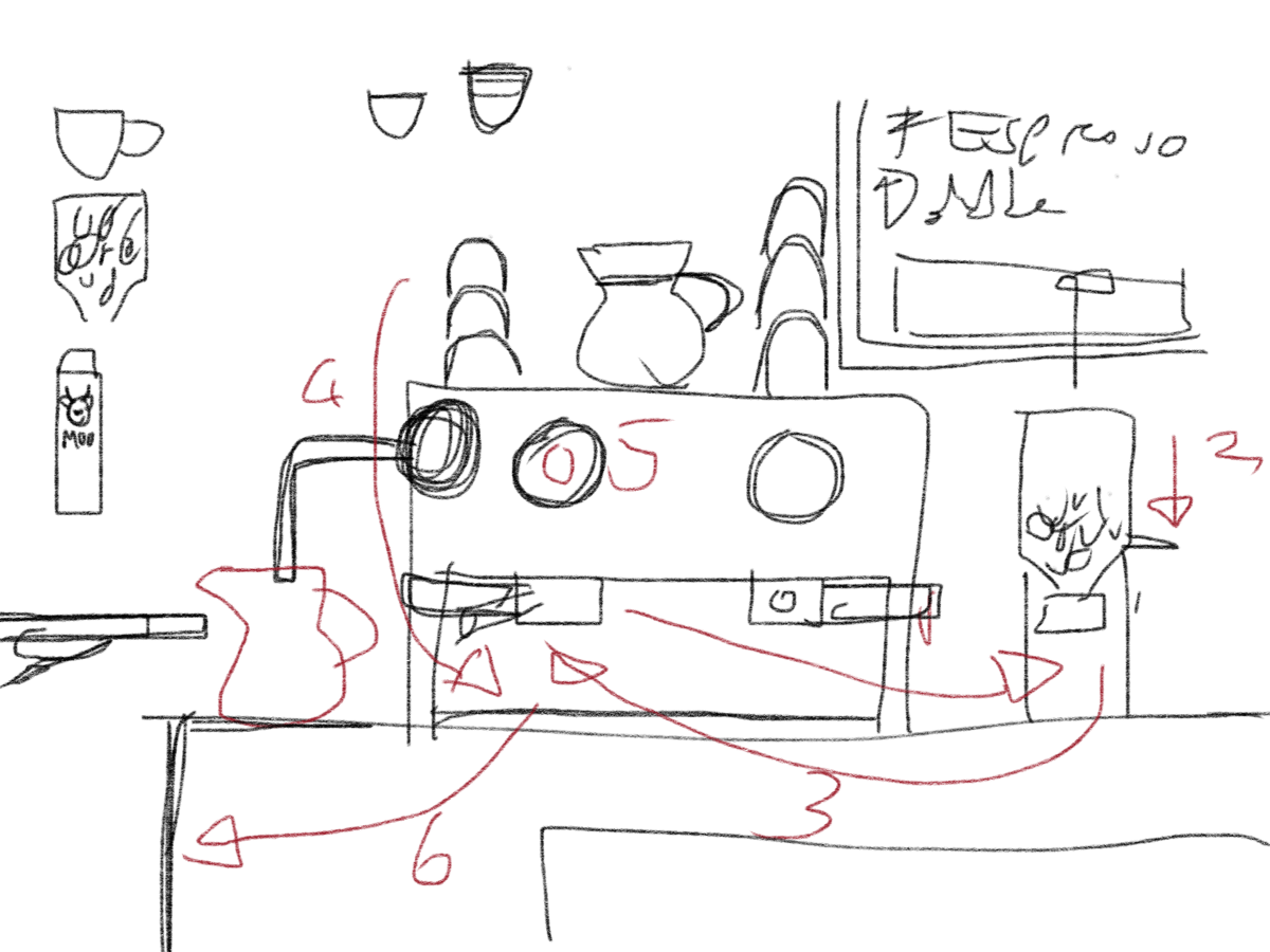
You are a Barista and have to serve up various espresso-based beverages as quickly as possible using your shiny espresso machine (other colours available!) You get to screw up the orders three times before you’re fired, with bonus points being awarded if you’re quick.
Although visually much more complicated, the actual mechanics are a lot more straightforward as the interactions are all either tapping or dragging and, other than taking advantage of the collision detection, won’t need the physics engine at all.
Similar games have existed since the birth of the touchscreen as dragging things around is such a natural fit. There is a risk that this style of game is so over done that it simply won’t be fun or interesting enough, but I’ll have a prototype up and running in a few hours and will hopefully find out sooner rather than later.
Making It Universal
Universal apps are the Way of the Future, so it’s important that it works just as well on the iPad as it does on the iPhone.
There’s various different ways of managing Universal Apps in Sprite Kit. In Ray Wenderlich’s 2D iOS and tvOS Games by Tutorials, the authors take a aspect fill scaling approach, where all of the design is done using the largest device resolution (which, at the time of the book’s publication, was the iPad Air but is now the iPad Pro, although I think I’ll stick with targeting the Air) and a hardcoded size of 1536 x 2048 is passed to the scene.
The device then scales the scene to fill the window, cropping as necessary.
Everything within the scene is calculated relative to the scene’s size, not the device’s screen size. This means that, for example, positioning something at 0,0 will mean that it is hidden on all the phones.
A simple calculation can give us the visible area and we use this as a "safe zone", which is the area that can be guaranteed to be seen on all devices.
Adding an SKNode that is the size of this safe area means that we can use relaive positioning on all of its children (e.g., a position of 0,0 will be the bottom left of this safe zone and visible on all devices).
The advantages of this approach are that only one size of asset is required, created for a Retina iPad, as everything will be scaled down (even on the iPhone 6+) and so should look sharp on all devices.
Another advantage is that the gameplay remains the same for everyone. Everything is positioned on screen in the same relative position for all devices, just smaller on some and with more of an outer a margin on others.
This wouldn’t necessarily be the case if I was using the device’s natural screen size. If I have an @2x sprite that is 300 x 200 points, then it’s going to take up more space on the smaller iPhone 5 screen than on the iPhone 6.
In the screenshots above, all these boxes are 100 x 75 points. The scaled iPhone 6 boxes are rendered a lot smaller than the non-scaled one, with the iPhone 5 boxes smaller still. However, they maintain their relative distance from each other.
In the non-scaled version, on the other hand, the boxes remain the same size on both devices but on the iPhone 5 they are also physically closer together.
For most game types this isn’t a problem. For example, games with a large play area that scrolls as you move, then you just get to see a little more or less further afield depending on your device (although this itself could be an advantage).
However, for this game it makes things easier for those with smaller devices, as the relative distance that something has to be dragged is made that much smaller.
The disadvantage with using scaled images is the app bundle size and memory usage—the iPad background (a 1536 x 2048 pixel image) will be downloaded by everyone and will be loaded into an iPhone 5’s memory just to have it scale down by over 50% (to display on a screen that is only 640 x 1136 pixels).
Given how few assets this game will have, I don’t think it’s a problem in this case scaling is not only easier, but probably a better fit.