Last year I wrote about my Generic Node Component which I use as the basis for displaying nodes in an ECS-based game. Since then, I’ve refined this approach in a couple of ways.
A GKEntity Subclass That Always Adds This Component
The vast majority of entities will appear on screen in one form or another, so it makes sense to have a GKEntity subclass and add this component during initialisation:
class AKEntity : GKEntity {
	func init() {
		let compNode = NodeComponent()
		self.addComponent(compNode)
		super.init()
	}
	required init?(coder aDecoder: NSCoder) {
		fatalError("init(coder:) has not been implemented")
	}
}
Instances of the SKNode base class don’t do any drawing by themselves so even if it is the rare entity that doesn’t draw to screen, there’s no real cost to having it set up a node component.
Interaction Nodes
The biggest change was the internal layout of the node component’s nodes. It now has two children—an interactive and non-interactive node.
The interactive node is a specialised subclass of SKNode called InteractionNode that is set up to receive and process interactions from either mouse or touch inputs. Only this SKNode subclass and its children will participate in the interaction system.
These two nodes define two new hierarchies, one for parts of the entity that can be directly interacted with, and one for decorative elements around the node—Particle effects, labels, health bars, etc. would all go in the non-interactive node tree.
Scaling
Initially, I had the scale component act on the root node of the node component. The problem with this approach is that sometimes there are elements within the hierarchy that I do want to scale, like character sprites, and others that I don’t want to scale, like labels and health bars.
Now, both the interactive and non-interactive nodes have an additional child each that are for elements that should be scaled. The complete hierarchy looks like this:
	                ┌──────────────┐
	                │   Root Node  │
	                └──────────────┘
	                        │
	          ┌─────────────┴─────────────┐
	          │                           │
	          ▼                           ▼
	┌──────────────────┐        ┌──────────────────┐
	│ Interactive Node │        │  Non-interactive │
	│                  │        │       Node       │
	└──────────────────┘        └──────────────────┘
	          │                           │
	          ▼                           ▼
	┌──────────────────┐        ┌──────────────────┐
	│    Scaled Node   │        │    Scaled Node   │
	└──────────────────┘        └──────────────────┘
When adding children, users can define where they want that child added:
compNode.add(spriteNode, interactive: true, scalable: true)
compNode.add(labelNode, interactive: false, scalable: false)
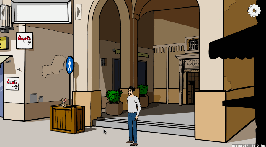
A Practical Example
In AdventureKit, the characters can scale as they move in and out of the scene but the speech bubbles that appear above them should always be at the same distance above the sprite and have the same font size so that they remain legible.
The Node Component exposes a method where users can request just the frame of the interaction node, then use this as the basis to calculate the position of the dialogue balloon:
guard let compNode = self.entity?.component(ofType: NodeComponent.self) else {
	return
}

let frame = compNode.frame(includeNonInteractiveElements: false)
self.dialogueBalloon.position = CGPoint(x: frame.origin.x + (frame.size.width / 2), y: frame.origin.y + frame.size.height)
This guarantees that the dialogue balloon will always be centred above the character, however much the character is scaled or wherever it moves:
It also ensures that this dialogue balloon is not included in any frame calculations. If the dialogue balloon was included in the calculation, the height of the accumulated frame would include the height of the balloon. Moving the balloon to a position above this height would then increase the accumulated frame for the next calculation, which would move the balloon even higher, and so on.
Reusable Components
The advantage of this approach is that the component that displays the dialogue balloon can easily be customised. In AdventureKit, the font, font size, background, and balloon tail can all be set on a per-entity basis and it all gets positioned correctly.
This component can also be added to any entity. It will happily display dialogue purely based on the frame information of the generic node component (which every entity is guaranteed to have) without knowing anything about the node’s hierarchy.
This means that it can easily be reused for things like credit sequences or captions: